Tuesday, November 29, 2011

Anniversary Celebration: Sketch Challenge by Julia Stainton


This is my creation for the Anniversary Celebration Sketch Challenge by the talented Julia Stainton.  Ellen is celebrating her 5th anniversary with some great prizes and challenges.  You really should check it out!

The Night Before Christmas was always our children's favorite story as they were growing up and they never grew tired of hearing it over, and over and over.....so I decided to make my own wee version of the book. 

It is hard to see in the photo but the book does have several pages.  I distressed it a fair bit, added a bookmark and hand stitched it down the centre - just like the original books were made. This was just way too much fun to make!

Here is the link to Ellen's blog if you would like to join in the challenges:


Saturday, November 26, 2011

Unscripted Sketches #134


SarahKaye has given us another fabulous sketch to work with this week!

I love this background stamp that I chose for this card....it is so elegant and wedding appropriate!  I embossed the image with Silver Pearl (CTMH) powder for a rich and elegant look suitable for a wedding card.  The bride and groom are probably a wee bit too contemporary for this card but it was the only wedding stamp that I have!

Please click on the link below to check out the inspirational buffet that the DT has prepared!  The sky is the limit with this sketch so get busy crafting and share your creations with us at Unscripted Sketches!

http://unscriptedsketches.com/

Sunday, November 20, 2011

colourQ challenge #111...


Another beautiful color combo!  I am always so inspired by the rich 'earthyness' (a new word I made up!) of colors like these.

I kept the card quite simple.  I stamped the tree and sentiment with Crumb Cake but it just didn't pop, so I very carefully stamped over the images with Versamark and embossed with clear embossing powder.  This deepened the color just enough to give it a bit of depth. You can see the gloss better in the real life card. 

I punched the dots from Pear Pizazz, Pumpkin Pie and Rich Razzleberry and randomly glued them on the tree.  The Pear Pizazz doesn't show up well in the photo...but it is there.

You just have to visit ColourQ and check out the A-M-A-Z-I-N-G cards that have been submitted.  Honestly, I would like to CASE them all!  Here is the link if you would like to join in this week's color challenge:

http://colourq.blogspot.com/2011/11/colourq-challenge-111.html

Thanks for stopping by!  Have a happy Sunday.

Saturday, November 19, 2011

Unscripted Sketches #133


Another fun sketch that had my head spinning with ideas!  This is a piggyback challenge as well.  The piggyback challenge is to not use any pre-printed patterned paper so I chose my snowflake Cuttlebug folder for my mat.

I wanted to use non-traditional colors on this card.  I punched a donut shape from an adhesive sheet to use as a base for the wreath.  I layered the punched branches (aqua, silver, aqua) onto the adhesive circle.....an easy peasy way to assemble the wreath in no time at all!

A bit of ribbon, a bit of  bling for the berries and a punched sentiment.  Ta da - done!

We would love to have you play along with us this week at Unscripted Sketches.
Just click on the link below and check out what the other designers have created.  Prepare to be inspired! 


Saturday, November 12, 2011

Unscripted Sketches #132


I am beyond thrilled to have been asked to be part of an amazingly talented design team at Unscripted Sketches!  Never in my wildest dreams would I have imagined that an opportunity like this would be offered to me.  Honestly, I was sure that Arielle had the wrong e-mail address when she contacted me. I sincerely hope that my projects will help to inspire your imagination & creativity! 

I love working with sketches!  I find that I waste so much time sitting at my craft table trying to decide how to lay out my card.  Sketches provide a starting point for my project and can allow great versatility in interpretation just by flipping/rotating the sketch.

The snow has fallen here in Manitoba, so these cute little penguins seemed most appropriate!  Heat embossing the penguins gave them a nice rich, dark black color and really makes them pop!  The stamp set is Winter Wonderland (Recollections).

I really get excited when I get mail so please feel free to drop me a line anytime!

This is another version of  the sketch.  I popped a wee chickie into the line-up instead of the penguin.

Sunday, November 6, 2011

colourQ challenge #109...


One day later...added the wee fish, tweaked the oyster a bit and added a star fish!


A fun card for today's challenge.  Indigo Blue made me think of ocean, so this is what I came up with!

The clam is made from my scallop circle punch.  I would have liked it to be just a wee bit smaller but this was the only size I had.  The pearl is four - 1/2" circles glued together and then covered with Frost White All Purpose Liquid Ink (Stampin Up)....looks like a real pearl!  The fish are all made out of circle and heart punches.  The scales on the fish are from a wee banner punch that I had - how perfect are they?

I covered the sand at the bottom with a clear sparkle dust just to give it some zing.  The waves are from my new MFT Large Scallop Die (love it!).  Card base is Soft Suede.  The sentiment (although a bit cheesy!!!) is computer generated.

Here is the link if you would like to play along:


Have happy day everyone!


Thursday, November 3, 2011

Playing in Paradise #39


A second entry into Playing in Paradise Challenge #39 - Masculine cards or projects! This is a card that I pulled from my stash and is one of my all-time favorite guy cards. I love the different 'masculine' features on this card - the cork mat, the embossing folder, the metal brads, the twine, the stamped image.....

Note: I am having major troubles with Blogger right now so I have switched to the old photo editor (a suggestion I found in the Help section). I really do hope this uploads properly as I already have THREE "where has my photo gone to" issues on the Scrapper's blog. If I have messed up yet again, I apologize and thank you for your patience.


Here is the link if you would like to play along:
http://scrapbookersparadise.blogspot.com/2011/10/playing-in-paradise-39.html


All supplies are from Stampin' UP!


Thursday, October 27, 2011

Playing in Paradise #39 and Textured to Perfection


SANDPAPER = A masculine card with texture!

I just visited the Scrapbooker's Paradise blog and realized that this card is also perfect for their current 'masculine card' challenge.  I originally made the card for the Textured to Perfection challenge at the Moxie Fab World.

The first mat is black sandpaper.  The second 'mottled' layer was achieved by spreading glue on a piece of cardstock, crumpling up some tissue paper and gluing it onto the cardstock.  I then sponged ink on to the tissue, using a metallic pigment ink last to give it a bit of a sheen.  The various circles were cut from sandpaper (different colors and textures) with my nesties and circle punches.

If you would like to play along with the Scrapbooker's Paradise masculine challenge, here is the link:
http://scrapbookersparadise.blogspot.com/2011/10/playing-in-paradise-39.html

Wednesday, October 26, 2011

colourQ challenge #108...


What a pretty color combo! "Daffodil Delight" jumped right out at me the minute I saw this so I decided to go with a flower themed card.  However, the urge to make just one more Halloween card was definitely there!

I used my SU textured paper (hard to see in the photo) as the colors just seem that wee bit more intense!  My new dies just arrived from MFT so this was an opportune time to put them to use.  The sentiment (the only white color in my project) is from an old SU rub-on set "Love and Happiness". 

Again, I went for clean & simple.  I'm beginning to think that I might just be defining my style more and more with each passing challenge.

This is a great color combo, so please play along at CQ at the following link:

Hope everyone has a happy day!


Tuesday, October 25, 2011

CFC25: CAS-ual Fridays, The Clean And Simple Challenge! and 2011 October Papertrey Blog Hop Challenge


I am entering this card in two challenges, both listed above.

Normally when doing a spotlight technique, the larger image is left uncolored, however, I wanted to highlight the colored pumpkins so I reversed the process and left the inset inchie uncolored! 

I stamped the pumpkin cluster on watercolour paper (it is hard to see in the photo).  I love the texture that this paper gives an image. The pumpkin cluster is a combination of two different stamps. I used the masking technique to create the image that I wanted. 

The pumpkins were colored with Copics.  I kept the rest of the card relatively simple to keep the focus on the colored image!  A small stamped sentiment and the card was complete. 

If you would like to play along at CAS-ual Fridays with this week's sponsor being Clear and Simple Stamps, just click on the link below:
http://cas-ualfridays.blogspot.com/2011/10/cfc25.html

Friday, October 21, 2011

colourQ challenge #107...


.

What a great Halloween combo! I wanted to keep this card very clean and simple so I focused on two main colors - Lucky Limeade & Rich Razzleberry.  I used my Pumpkin Pie Stampin' Write marker to color in the socks. 

The boots were originally stamped in Early Espresso but they weren't dark enough so I went over them with my Early Espresso Stampin' Writer as well (they actually look black in the photo).  The 'BOO!' sentiment (that I totally LOVE)  is stamped in Early Espresso.  I found this little gem at a garage sale ages ago - origin unknown
I found it difficult to capture the true Limeade color.  My camera kept wanting to give it a yellowish hue.  I finally took the card outside and was happy with the
results.

Visit the ColourQ link below and join in the challenge fun!  

HALLOWEEN rocks!


Friday, October 14, 2011

CFC24: Create a Clean And Simple Halloween project with NO orange. Not even a tiny spot!


This card is quite clean and simple but I use the word 'simple' very loosely!Somewhere in my travels I saw a picture of this tree.  Of course, I didn't have a stamp that even closely resembled the tree.....so I photocopied the picture (probably illegal), cut out the tree (believe me it took 4000 hours to cut those branches), traced it onto black cardstock and cut it out AGAIN! 

I also hand cut the grass because once again, I didn't have a grass die cut or  punch.  The moon was punched from Crushed Curry and edged with Riding Hood Red (not orange). I stamped the bat and the sentiment with Stazon ink, ran some Basic Grey paper through an embossing folder and added  a couple of brads.

If you would like to play along with this challenge or if you would like to see the awesome Halloween cards that the design team created, then just click on the link below:

http://cas-ualfridays.blogspot.com/2011/10/cfc24.html


colourQ challenge #106...

                                         
This is my second entry into this week's challenge.  For this card I used black for the card base, basic grey for the mat, masked a white frame with post-it-notes and sponged my sunset sky with Tangerine Tango & Crushed Curry.  I wanted the tree and the sentiment to be a nice deep black so I stamped both with Stazon ink. 

I hope this card will "INSPIRE" you to join in the fun challenges at colourQ.  Here is the link to challenge #106:


Wednesday, October 12, 2011

Breast Cancer Awareness Challenge


A double challenge in The Classroom along with the support of Unity Stamps.

The first is to make certain that you do your self-examinations and schedule a physical/mammogram if you haven't done so yet this year. This first challenge is one that may save your life --- please do it!

The second part of the challenge is to make a blank Thank You note. Please visit The Classroom to find out how you can make a difference to families affected by Cancer.  Here is the link:

I kept my card subtle and simple so that the words written inside would be the focal point of this creation.

colourQ challenge #106...


Okay, so I cracked myself up when I came up with this caption.....We 'herd" you are moooo-ving !!! 

The inside says "to greener pastures".

I just love this cow stamp and figured that just one cow wasn't enough so I did a bit of masking (love this technique) and created a herd!  I was having trouble finding a spot for Basic Grey so I used my C1 - Cool Grey Copic marker to create a shadow under each cow (I think I might just be pushin' it a bit here!).

I really wanted to try to look beyond Halloween or fall so this is what I came up with.  Hope you like my take on this challenge!

If you would like to play along here is the link to challenge #106:

Monday, October 10, 2011

CFC23 Operation Julie's Smile


                     ....same card, photographed with a different background....
                             

Operation Julie's Smile is a great place to start for my very first CAS-ual Fridays challenge!

Please visit the link below to read about 'the mission to get Julie her smile back' and also to play along with the challenge. 

http://cas-ualfridays.blogspot.com/2011/10/cfc23-operation-julies-smile.html

Hopefully, Julie's days will soon be filled with 'Smiles and Laughter"  :)

Sunday, October 9, 2011

colourQ challenge #105...


... oh dear!  Company is arriving shortly, my dear sweet hubby is doing the dusting etc. and I am frantically trying to get my card posted!

Rushing does not pay off!  I really messed up stamping the salutation and didn't have time to redo the card, my poor little birdie looks like he has been sipping some brandy (note the 'lean') and my camera has made my Pear Pizazz look like Old Olive.   I am happy, however, with how the basket worked out. I cut thin strips of choc. chip & black; glued the brown strips onto the black strips and then actually wove the basket, securing the ends behind.

Happy Thanksgiving everybody!

Saturday, October 1, 2011

colourQ's 2nd Birthday CASE a Queen Challenge #104...


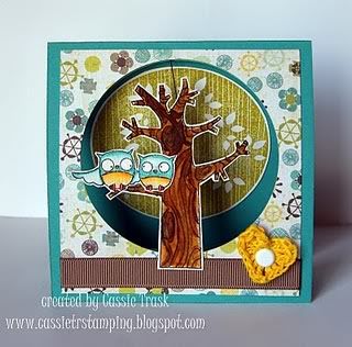
My version was cased from a cute card prepared by Cassie Trask show below:
Thanks for the inspiration Cassie!


I hand cut the tree trunk and branches and glued the green boughs (Martha
Stewart Punch) on to the limbs and then added a few rhinestones.  I embossed the snowflakes with Iridescent Ice, added a rub-on sentiment and some baker's twine.

Cardstock is Early Espresso, Old Olive, Pool Party and White (all Stampin' Up).  The embellishments are as close as I could get to Rose Red (I actually colored the brads with my Copic markers to get closer to the required shade).
Supplies:  Stampin' Up, Making Memories, Copic markers, Martha Stewart

Friday, September 30, 2011

Playing in Paradise Challenge #35


Did someone say 'Distressing' ..... I LOVE DISTRESSING!  It is one of my favorite techniques! Something about it, just gives a card a unique look.

I am attaching two photos as one shows the distressing better and the other better reflects the actual colors.

 I wanted this card to look really distressed and old. I was aiming for a stone top "coffin" and achieved this by cutting out my coffin shape, covering it with glue and then literally sprinkling sandbox sand on it.  After it was dry, I sponged on some black ink, gave it a shot of Vellum glue and then finished with a good dose of hairspray! That sand isn't going anywhere! The webs were stamped with Stazon and embossed.

The "mummy" (who is desperately trying to escape the coffin) is made with Stampin' Up taffeta ribbon that was inked and roughed up a bit with a pair of tweezers.  All other embellishments as well as the stamps are from my craft box, origin unknown.

If you would like to play along, plese click on the following link:
http://scrapbookersparadise.blogspot.com/2011/09/playing-in-paradise-challenge-35.html

Hope you like my spooky card!


Thursday, September 29, 2011

colourQ's 2nd Birthday CASE a Queen Challenge #104...


The card I chose to CASE is cQc#74 - Thanks Lindy G for your inspiration!

cqc#75


What a great challenge! My oh my, I had a real tough time trying to choose which card to CASE - they are all so amazing!  However, I am quite the Inchie fan and this card caught my eye so I figured I would give it a whirl.  Christina did a fantastic job on her card, which inspired me even more!

I wanted to try give the card some depth so I started by embossing white cardstock with the Swiss dot folder. I then punched out 1" squares, then punched various shapes within the inchie, then popped the inchie up on to the required colors of cardstock. I used DMC embroidery cotton to make my grid lines. I tried several different embellies in the upper left hand corner but settled for a simple salutation as anything more was just too much! 

All supplies are Stampin Up with the exception of the punches (Walmart, I think) and the DMC cotton.

My post would not be complete without a GRRRRRRRR!!!! Seriously, I took over 100 pictures in every imaginable space in our house AND yard (the neighbors must think I am nutso!) and I had to settle for a 'practise shot' because it was one of the few pictures that showed the details! I am actually showing two photos in an attempt to get a good picture!