Thursday, October 27, 2011
Playing in Paradise #39 and Textured to Perfection
SANDPAPER = A masculine card with texture!
I just visited the Scrapbooker's Paradise blog and realized that this card is also perfect for their current 'masculine card' challenge. I originally made the card for the Textured to Perfection challenge at the Moxie Fab World.
The first mat is black sandpaper. The second 'mottled' layer was achieved by spreading glue on a piece of cardstock, crumpling up some tissue paper and gluing it onto the cardstock. I then sponged ink on to the tissue, using a metallic pigment ink last to give it a bit of a sheen. The various circles were cut from sandpaper (different colors and textures) with my nesties and circle punches.
If you would like to play along with the Scrapbooker's Paradise masculine challenge, here is the link:
http://scrapbookersparadise.blogspot.com/2011/10/playing-in-paradise-39.html
Wednesday, October 26, 2011
colourQ challenge #108...
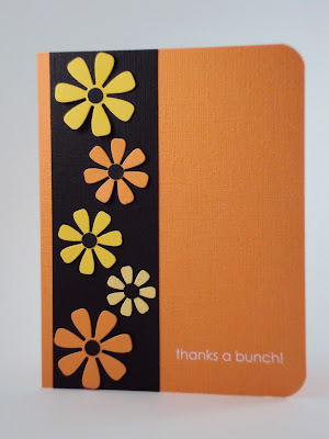
What a pretty color combo! "Daffodil Delight" jumped right out at me the minute I saw this so I decided to go with a flower themed card. However, the urge to make just one more Halloween card was definitely there!
I used my SU textured paper (hard to see in the photo) as the colors just seem that wee bit more intense! My new dies just arrived from MFT so this was an opportune time to put them to use. The sentiment (the only white color in my project) is from an old SU rub-on set "Love and Happiness".
Again, I went for clean & simple. I'm beginning to think that I might just be defining my style more and more with each passing challenge.
This is a great color combo, so please play along at CQ at the following link:
Hope everyone has a happy day!
Tuesday, October 25, 2011
CFC25: CAS-ual Fridays, The Clean And Simple Challenge! and 2011 October Papertrey Blog Hop Challenge
I am entering this card in two challenges, both listed above.
Normally when doing a spotlight technique, the larger image is left uncolored, however, I wanted to highlight the colored pumpkins so I reversed the process and left the inset inchie uncolored!
I stamped the pumpkin cluster on watercolour paper (it is hard to see in the photo). I love the texture that this paper gives an image. The pumpkin cluster is a combination of two different stamps. I used the masking technique to create the image that I wanted.
The pumpkins were colored with Copics. I kept the rest of the card relatively simple to keep the focus on the colored image! A small stamped sentiment and the card was complete.
If you would like to play along at CAS-ual Fridays with this week's sponsor being Clear and Simple Stamps, just click on the link below:
http://cas-ualfridays.blogspot.com/2011/10/cfc25.html
If you would like to play along at CAS-ual Fridays with this week's sponsor being Clear and Simple Stamps, just click on the link below:
http://cas-ualfridays.blogspot.com/2011/10/cfc25.html
Friday, October 21, 2011
colourQ challenge #107...
.
What a great Halloween combo! I wanted to keep this card very clean and simple so I focused on two main colors - Lucky Limeade & Rich Razzleberry. I used my Pumpkin Pie Stampin' Write marker to color in the socks.
The boots were originally stamped in Early Espresso but they weren't dark enough so I went over them with my Early Espresso Stampin' Writer as well (they actually look black in the photo). The 'BOO!' sentiment (that I totally LOVE) is stamped in Early Espresso. I found this little gem at a garage sale ages ago - origin unknown
I found it difficult to capture the true Limeade color. My camera kept wanting to give it a yellowish hue. I finally took the card outside and was happy with the
results.
Visit the ColourQ link below and join in the challenge fun!
HALLOWEEN rocks!
Friday, October 14, 2011
CFC24: Create a Clean And Simple Halloween project with NO orange. Not even a tiny spot!
This card is quite clean and simple but I use the word 'simple' very loosely!Somewhere in my travels I saw a picture of this tree. Of course, I didn't have a stamp that even closely resembled the tree.....so I photocopied the picture (probably illegal), cut out the tree (believe me it took 4000 hours to cut those branches), traced it onto black cardstock and cut it out AGAIN!
I also hand cut the grass because once again, I didn't have a grass die cut or punch. The moon was punched from Crushed Curry and edged with Riding Hood Red (not orange). I stamped the bat and the sentiment with Stazon ink, ran some Basic Grey paper through an embossing folder and added a couple of brads.
If you would like to play along with this challenge or if you would like to see the awesome Halloween cards that the design team created, then just click on the link below:
http://cas-ualfridays.blogspot.com/2011/10/cfc24.html
colourQ challenge #106...
This is my second entry into this week's challenge. For this card I used black for the card base, basic grey for the mat, masked a white frame with post-it-notes and sponged my sunset sky with Tangerine Tango & Crushed Curry. I wanted the tree and the sentiment to be a nice deep black so I stamped both with Stazon ink.
I hope this card will "INSPIRE" you to join in the fun challenges at colourQ. Here is the link to challenge #106:
Wednesday, October 12, 2011
Breast Cancer Awareness Challenge
A double challenge in The Classroom along with the support of Unity Stamps.
The first is to make certain that you do your self-examinations and schedule a physical/mammogram if you haven't done so yet this year. This first challenge is one that may save your life --- please do it!
The second part of the challenge is to make a blank Thank You note. Please visit The Classroom to find out how you can make a difference to families affected by Cancer. Here is the link:
I kept my card subtle and simple so that the words written inside would be the focal point of this creation.
colourQ challenge #106...

The inside says "to greener pastures".
I just love this cow stamp and figured that just one cow wasn't enough so I did a bit of masking (love this technique) and created a herd! I was having trouble finding a spot for Basic Grey so I used my C1 - Cool Grey Copic marker to create a shadow under each cow (I think I might just be pushin' it a bit here!).
I really wanted to try to look beyond Halloween or fall so this is what I came up with. Hope you like my take on this challenge!
If you would like to play along here is the link to challenge #106:
Monday, October 10, 2011
CFC23 Operation Julie's Smile
....same card, photographed with a different background....
Operation Julie's Smile is a great place to start for my very first CAS-ual Fridays challenge!
Please visit the link below to read about 'the mission to get Julie her smile back' and also to play along with the challenge.
http://cas-ualfridays.blogspot.com/2011/10/cfc23-operation-julies-smile.html
Hopefully, Julie's days will soon be filled with 'Smiles and Laughter" :)
Sunday, October 9, 2011
colourQ challenge #105...
... oh dear! Company is arriving shortly, my dear sweet hubby is doing the dusting etc. and I am frantically trying to get my card posted!
Rushing does not pay off! I really messed up stamping the salutation and didn't have time to redo the card, my poor little birdie looks like he has been sipping some brandy (note the 'lean') and my camera has made my Pear Pizazz look like Old Olive. I am happy, however, with how the basket worked out. I cut thin strips of choc. chip & black; glued the brown strips onto the black strips and then actually wove the basket, securing the ends behind.
Happy Thanksgiving everybody!
Saturday, October 1, 2011
colourQ's 2nd Birthday CASE a Queen Challenge #104...

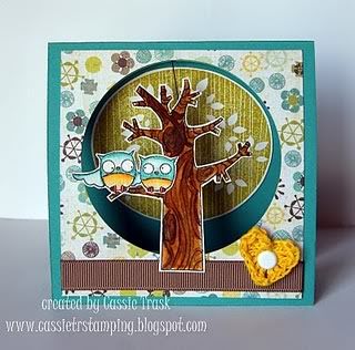
My version was cased from a cute card prepared by Cassie Trask show below:
Thanks for the inspiration Cassie!

I hand cut the tree trunk and branches and glued the green boughs (Martha
Stewart Punch) on to the limbs and then added a few rhinestones. I embossed the snowflakes with Iridescent Ice, added a rub-on sentiment and some baker's twine.
Cardstock is Early Espresso, Old Olive, Pool Party and White (all Stampin' Up). The embellishments are as close as I could get to Rose Red (I actually colored the brads with my Copic markers to get closer to the required shade).
Supplies: Stampin' Up, Making Memories, Copic markers, Martha Stewart
Subscribe to:
Posts (Atom)


