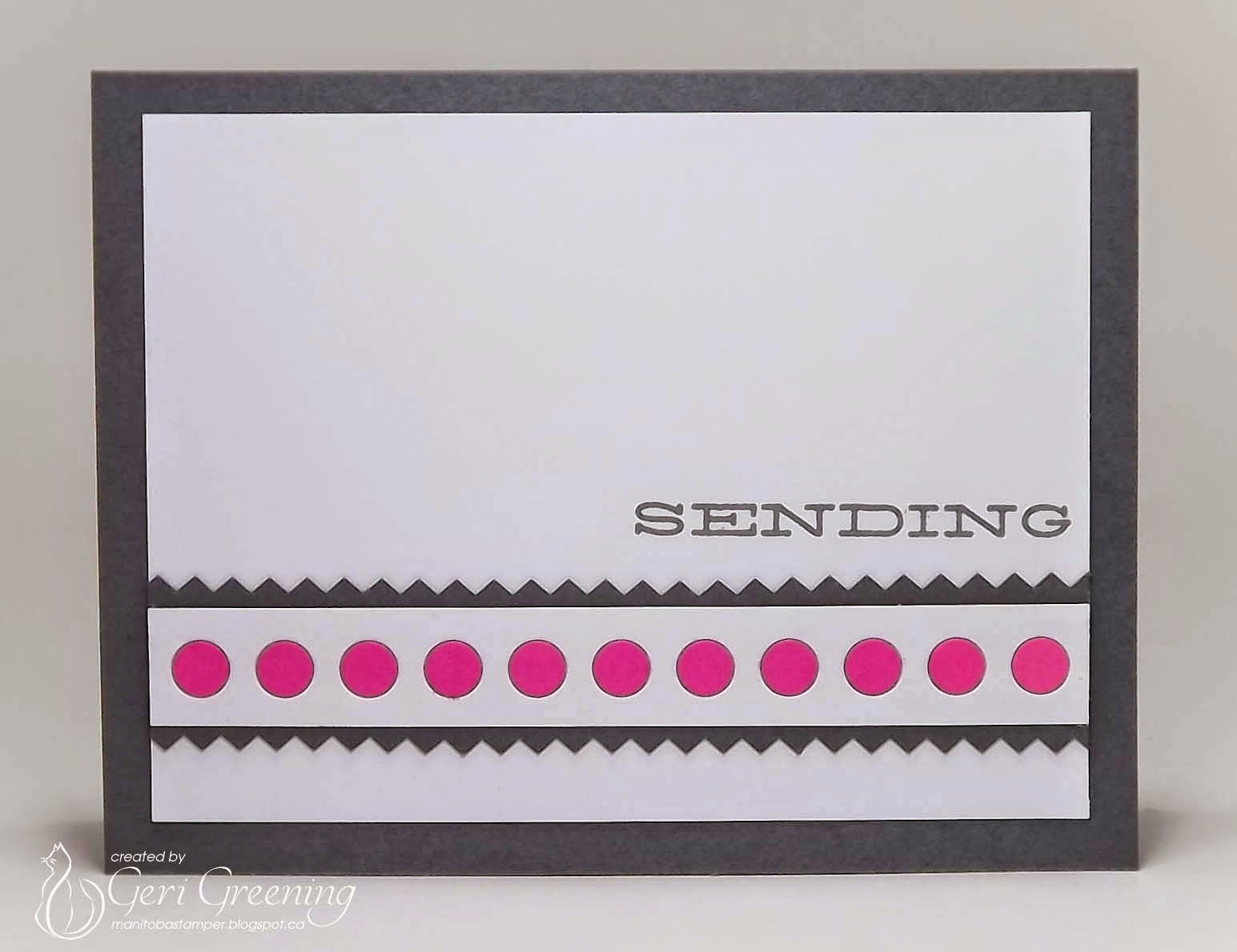
Nothing too much to 'splain about my card...the zig-zag border inspired by the chevrons, the polka dots from the blanket and a bit of a 'stripe' from the wall!
You may have noticed that the card on the main blog and the card in this post are not the same! The grey base seemed to overpower the pink...so I switched back to a white base.
Here's a pic of the grey base:
Happy crafting!
:) Geri


I love them both! The pinked edges of the grey strips are awesome and I love the pop of colour!
ReplyDeleteGeri, I love both. Beautiful cards.
ReplyDeleteI love both too! Stunning cards xxx
ReplyDeleteI love both too, Geri! This is such an amazing photo. I wasn't quite happy with my first card, you might have seen it on the private blog? But, I am much happier with my second card. ;)
ReplyDeleteI am loving your card Geri! It is so clean and crisp! And even though I love the white one better than the grey one, I still love the grey one too. lol I just think they are both simply gorgeous! Hugs, Brenda
ReplyDeleteFirst, may I say that it has been wonderful having you post your beautiful creations more often, Geri! I love this design so much! And I actually love both versions equally! You rocked the inspiration photo to inspire us and, honestly, I hadn't even noticed that that was a BABY's room! I don't know, though, how would that kid turn out, I wonder? I kinda liked that my kid's baby room contained a second-hand crib and rocker that I painted yellow. Even the changing table was second-hand. On the wall there were hand-drawn pencil sketches of Pluto, Mickey, and Donald that I made all by myself. There's a lot to be said for money, but there's a lot to be said for making it work with your own ingenuity and thriftiness, huh? I know you know what I'm talkin' about, LeRoy! Hugs, Darnell
ReplyDeleteFabulous card my sweet friend! I love your take on this sweet baby's room, I like Darnell have lots of used goodies and made all my own bedding and whatever else my sweet Ashleigh needed. Not near as talented as our sweet Darnell with the drawings.
ReplyDeleteNow on to your amazing card...I like them both and you get two cards out of the deal too. Hope you are doing well...miss you lots!
Oooh, Geri ... so much yumminess here ... these are gorgeous ... the pop of pink, the crisp zig zag edges, all the delicious white space ... love both versions equally, my lovely friend! Bisous Bisous, Anita :)
ReplyDeleteGeri, love the dots!! I've browsed a bit while here... seems you do, too! I'd love to see some of yours at The Challenge... any extras? .... hmmmm?
ReplyDelete=] Michele
I love them both! Amazing how different a card can be just by changing the base color! The result is two wonderful cards!!
ReplyDeleteLove the row at the bottom..such a crisp fun card!
ReplyDeleteHmmm, trying to make up my mind which one I like best, Geri ...think I have to go with the white one although I do like the grey one, too!!!! Love the crisp pink dots and the grey chevron strips!!!! Beautiful graphic look and a great take on the inspiration photo!!!!! Had you not mentioned it and had me look again, I would not have know that this was a baby's room!!!! My kids didn't really have baby rooms - we had the crib in our bedroom and they were sleeping there till they were big enough to sleep on a bed in a room where I made the curtains and that was about it!!!!! (...think I could have done more, but maybe for the grandchildren one day, hey!!!!!)
ReplyDeleteHave a lovely day!!!!